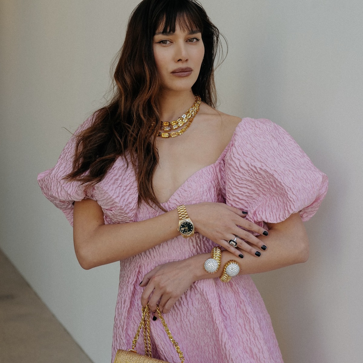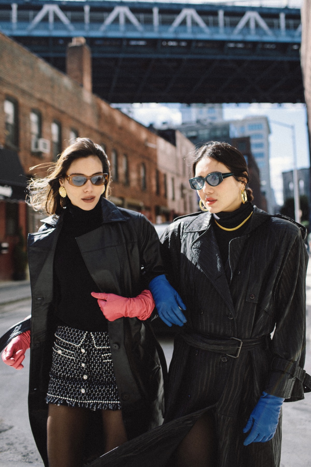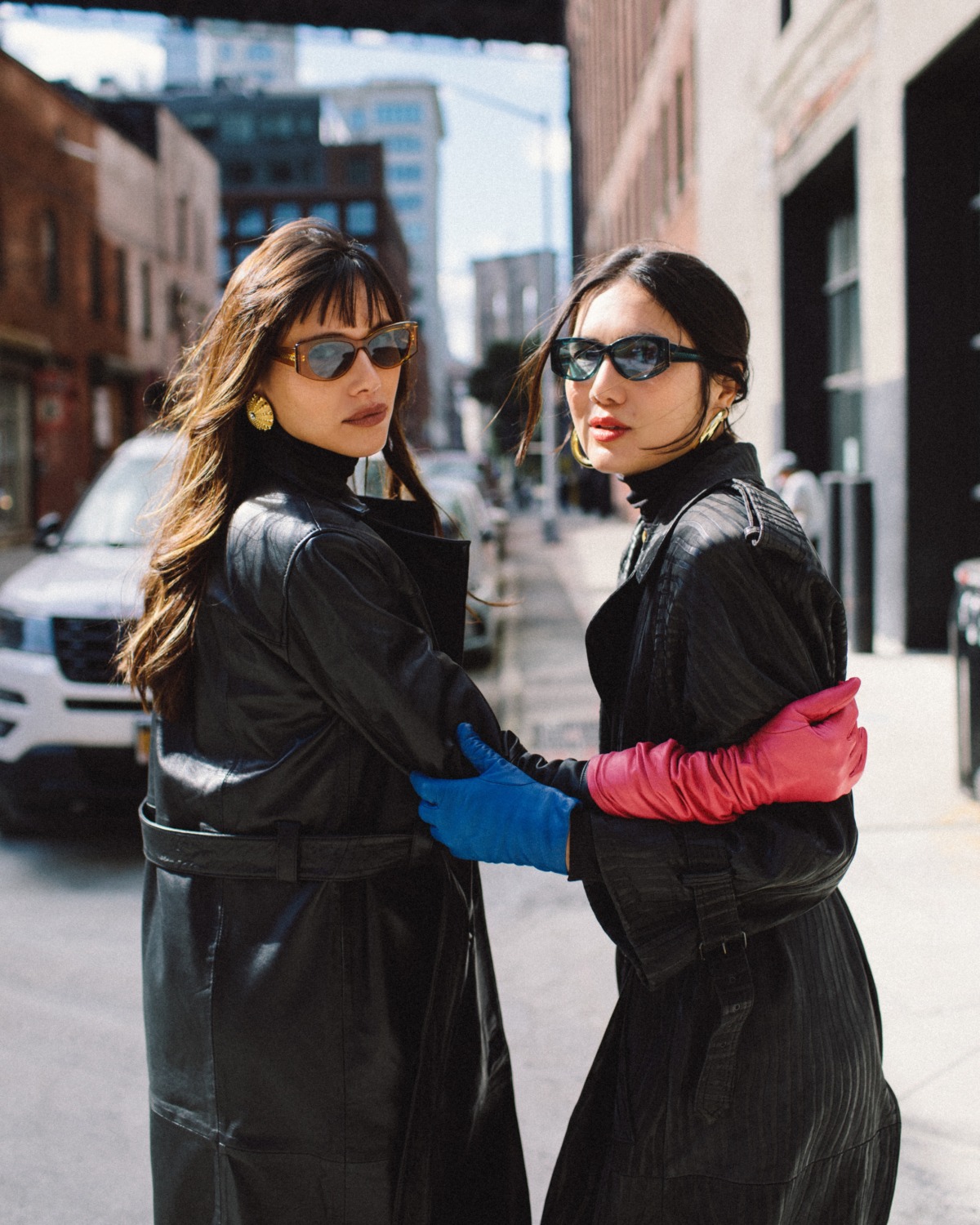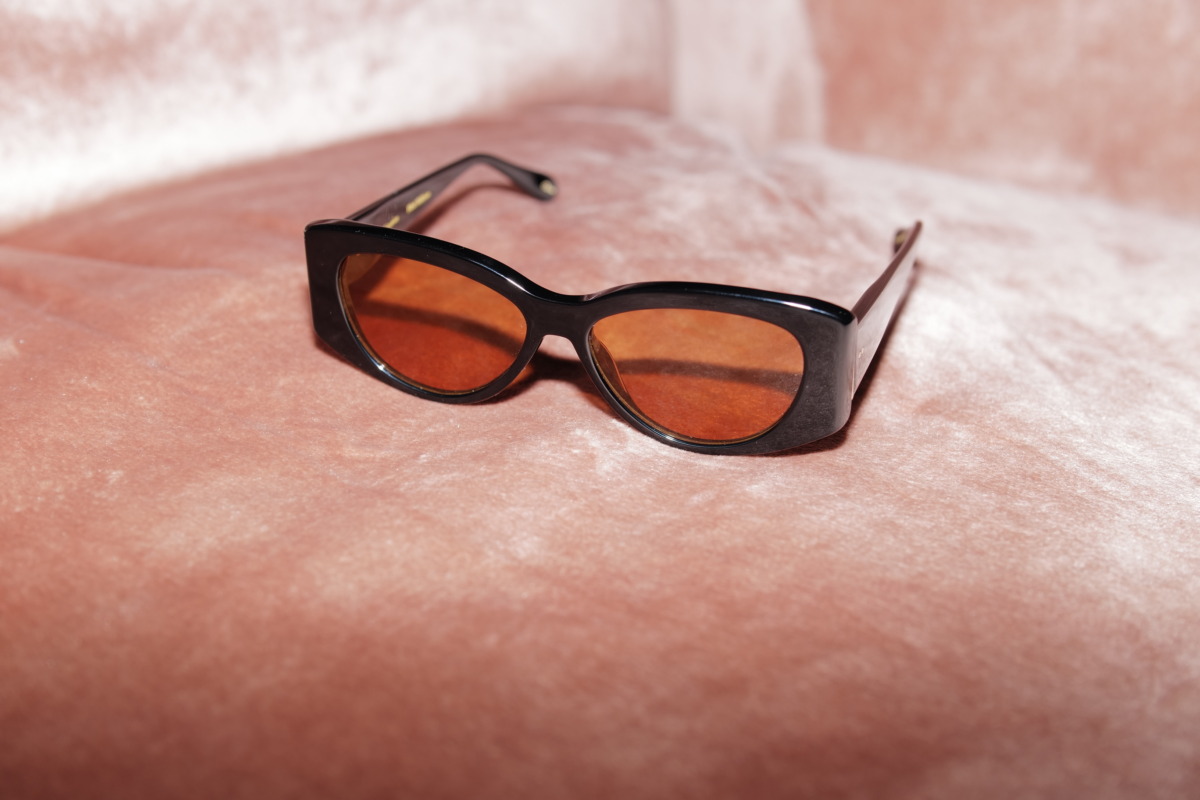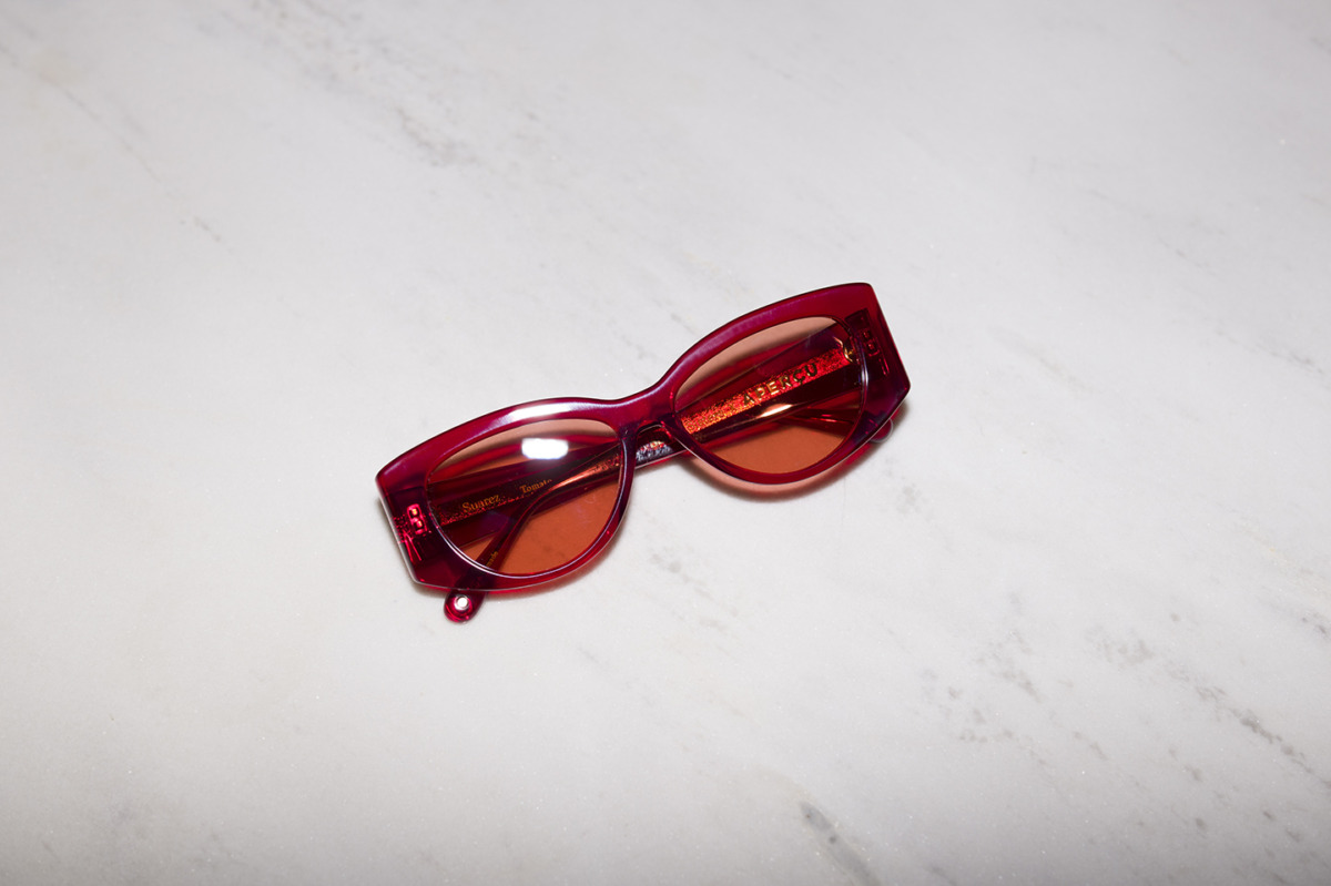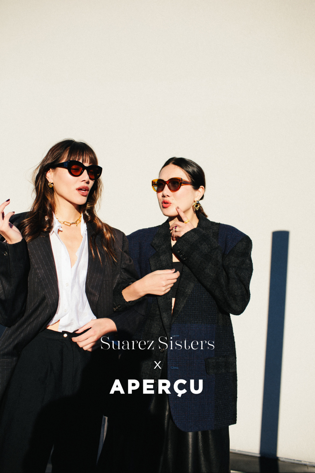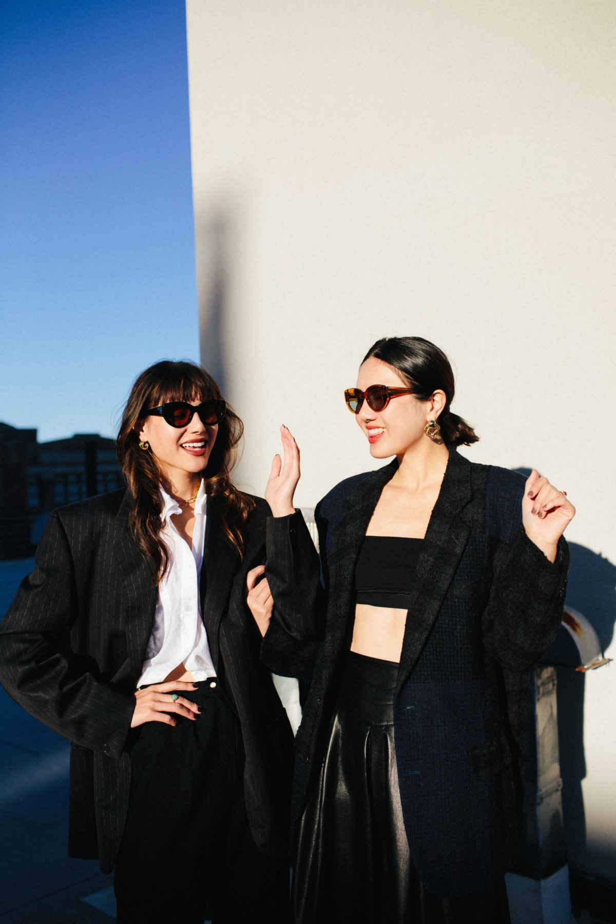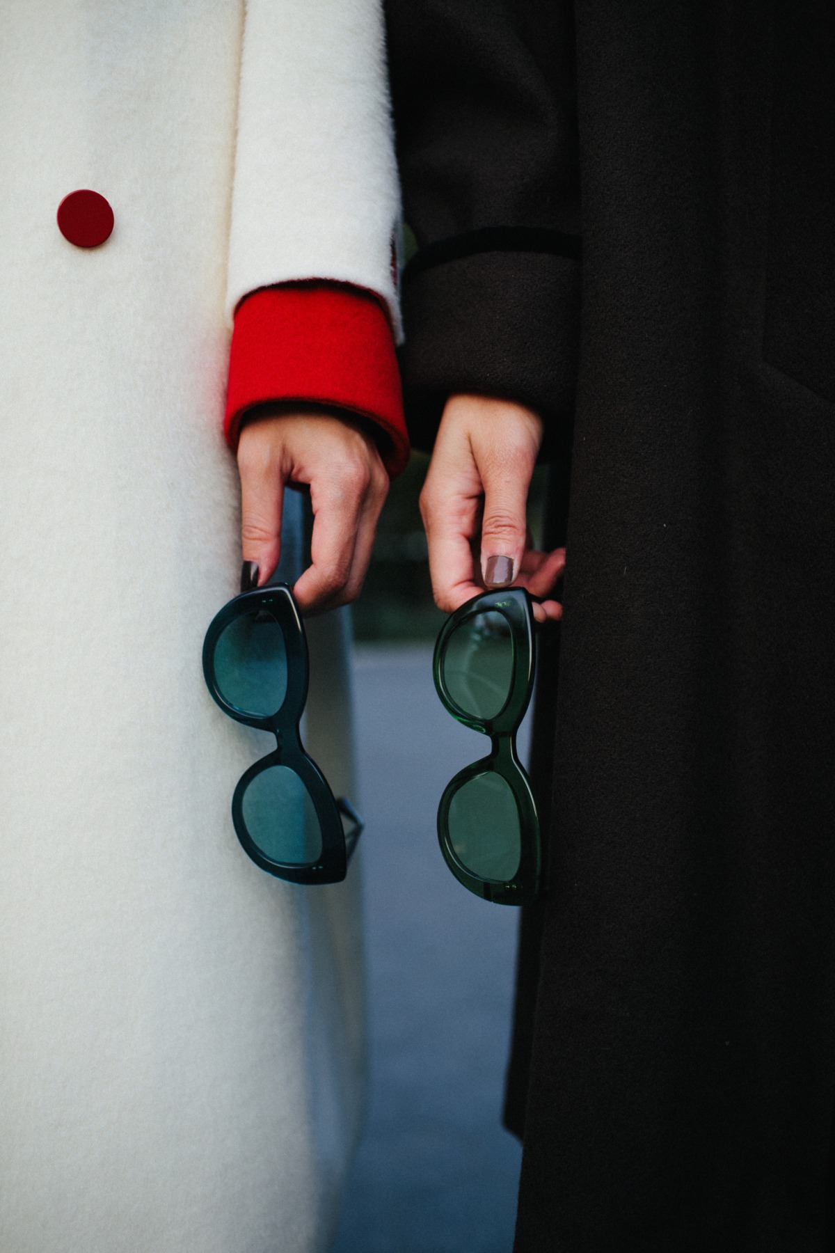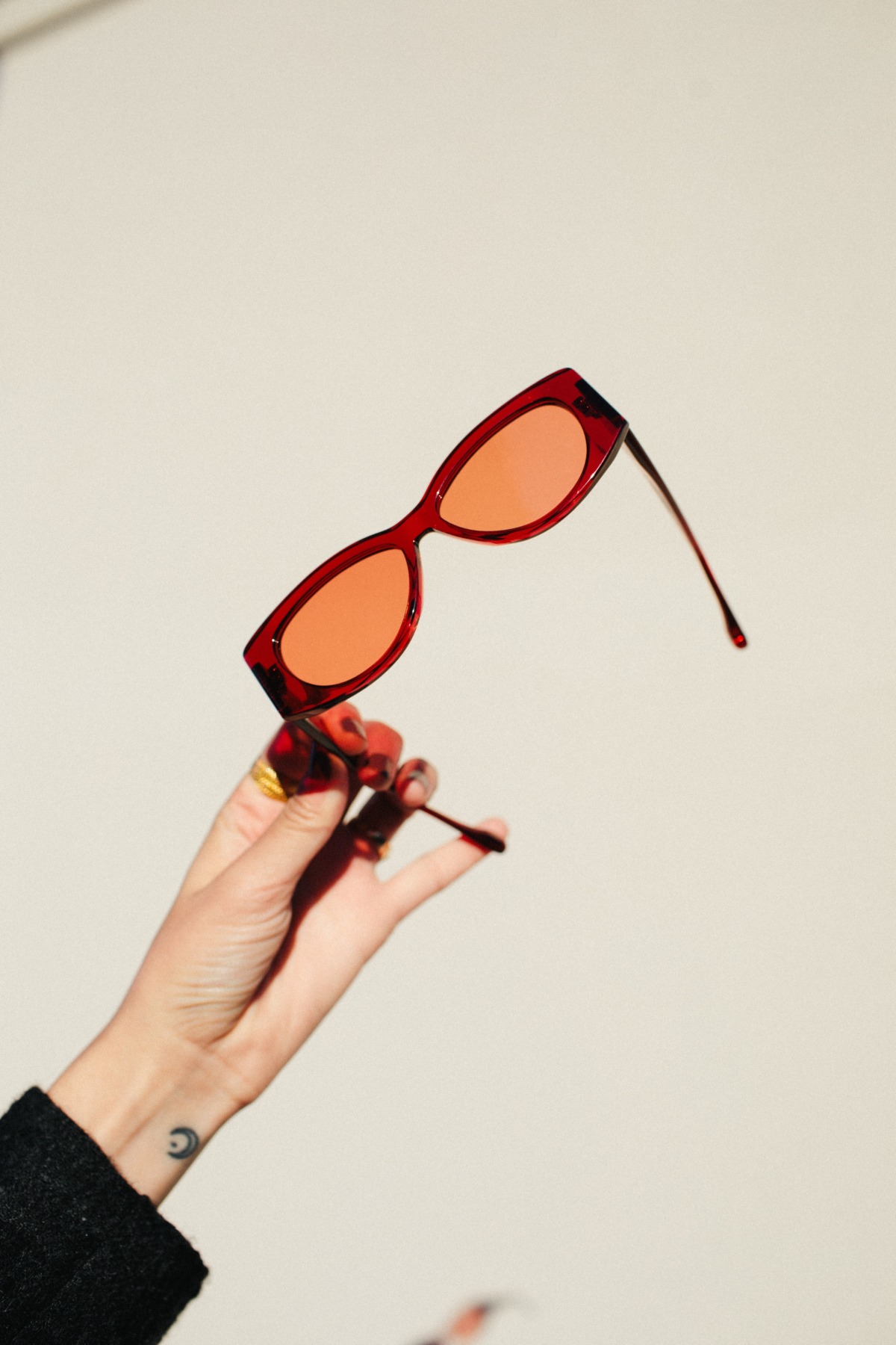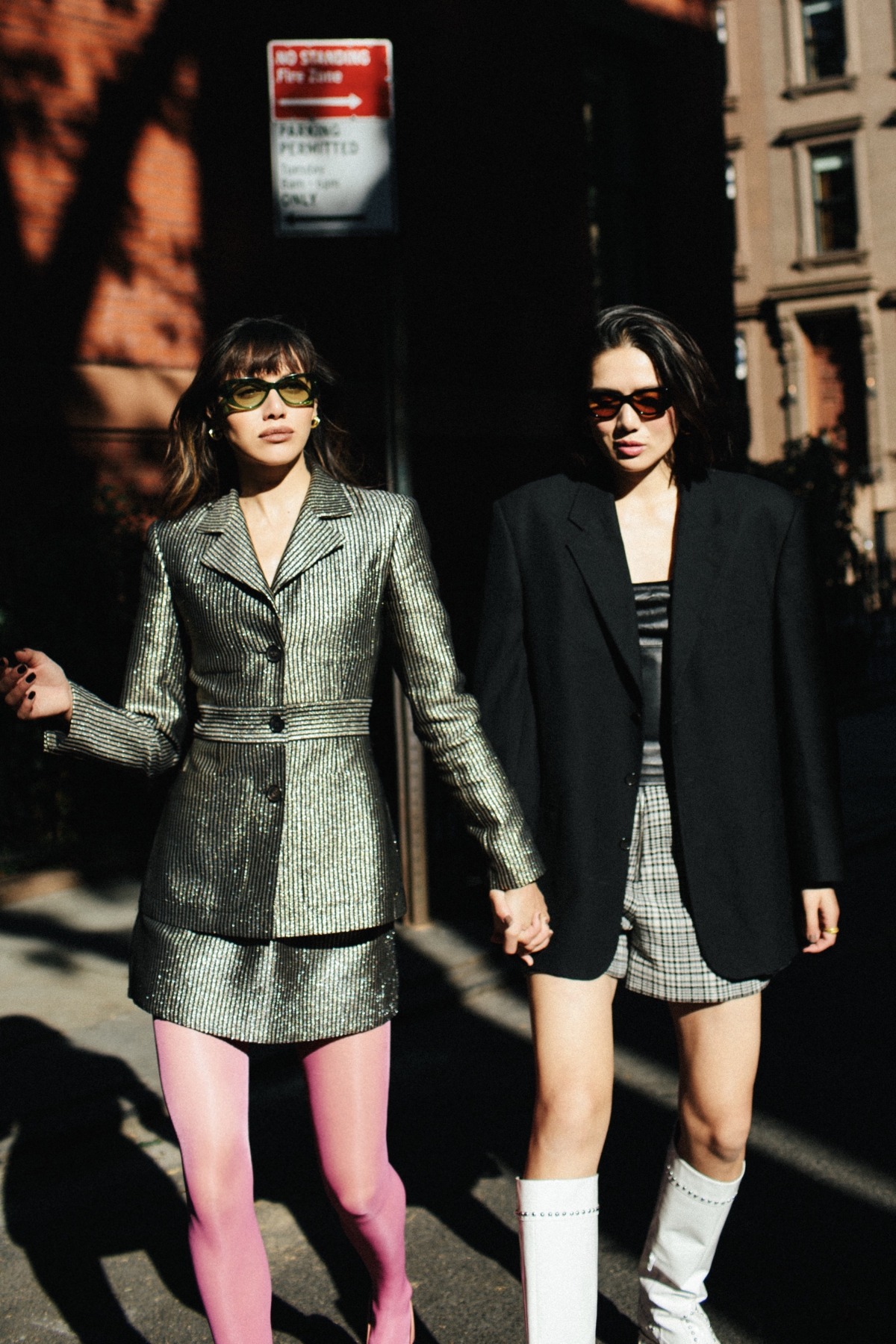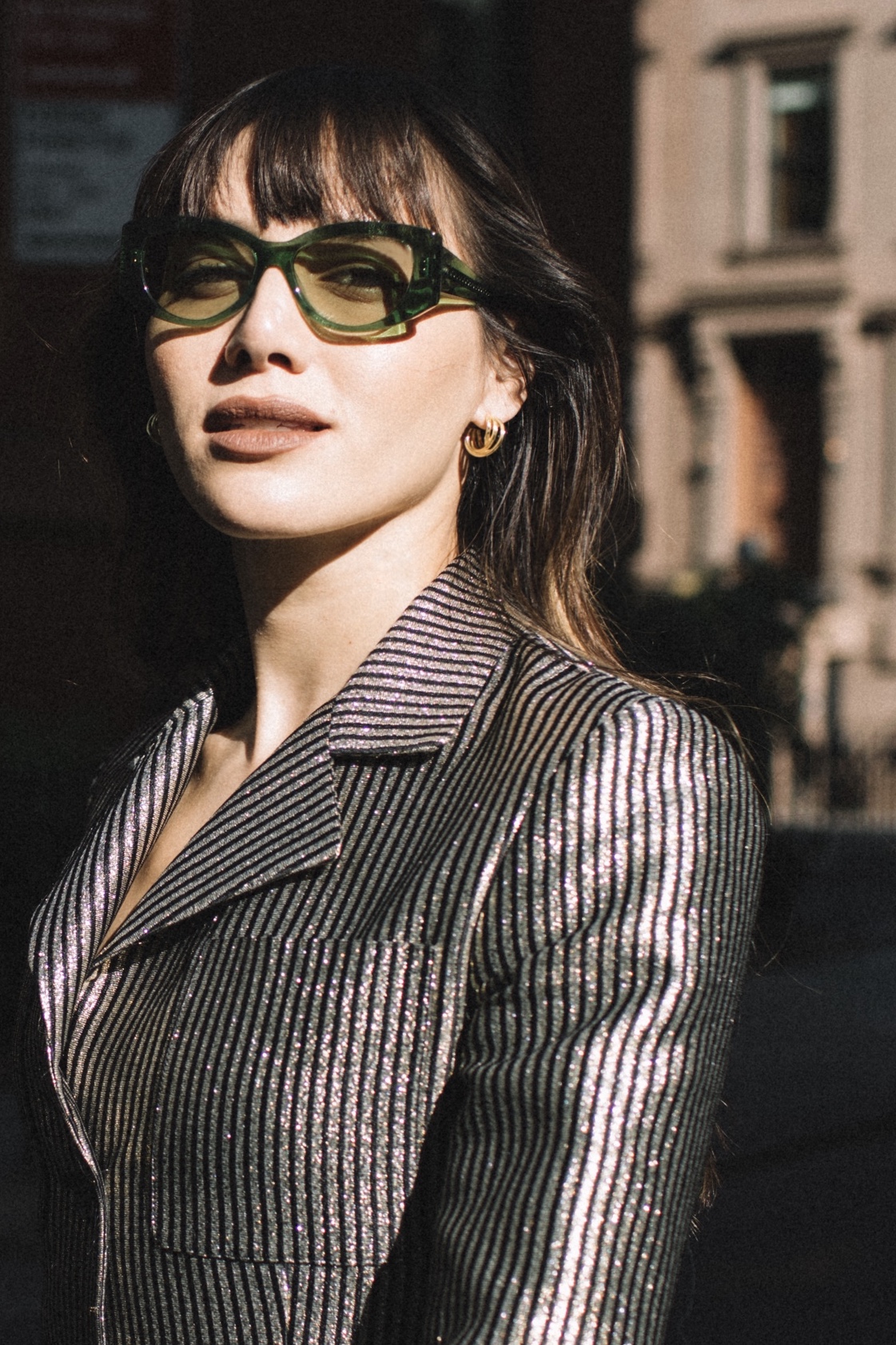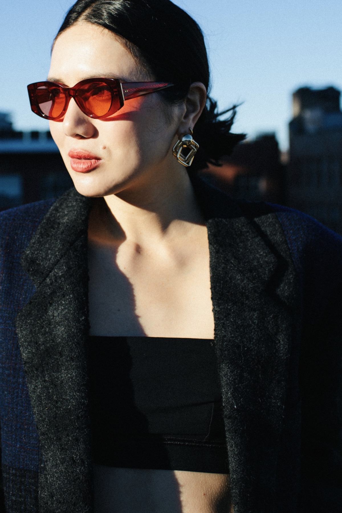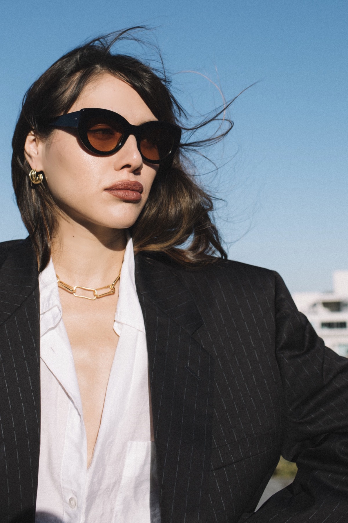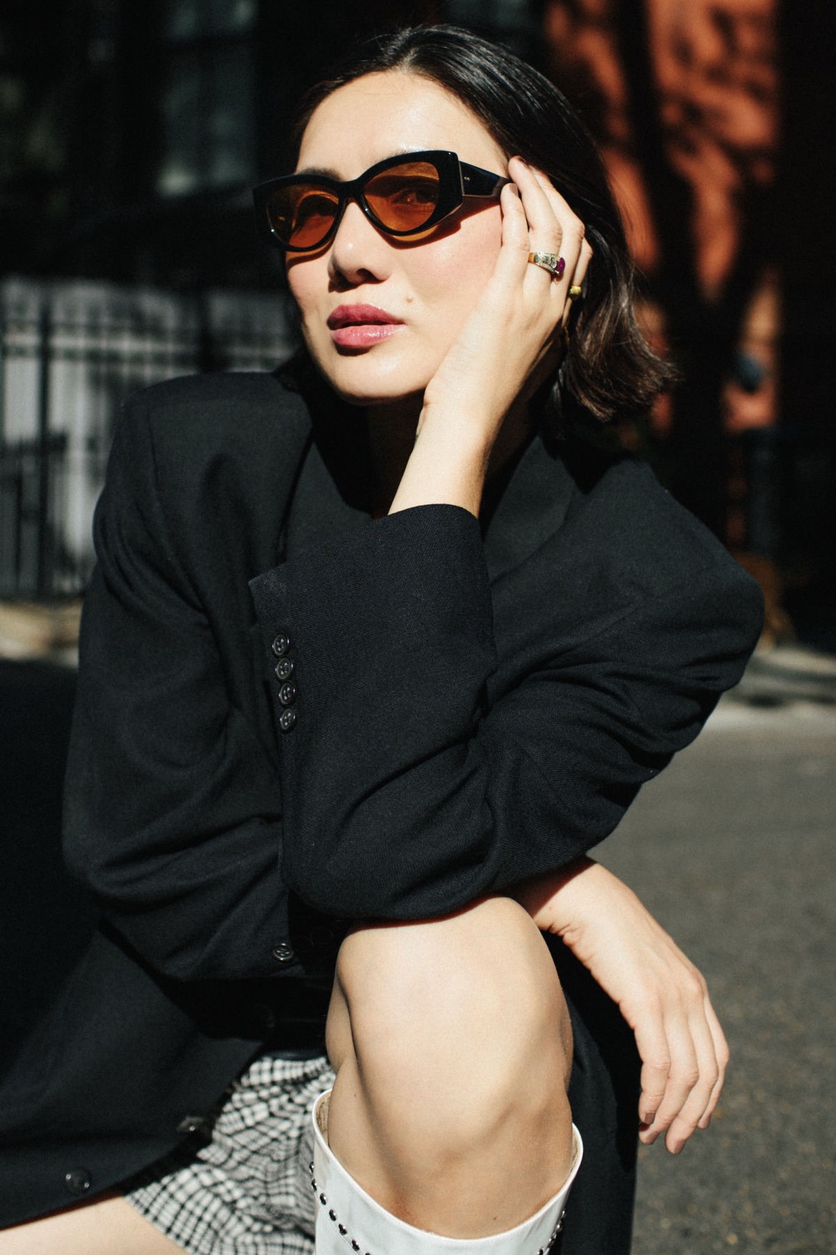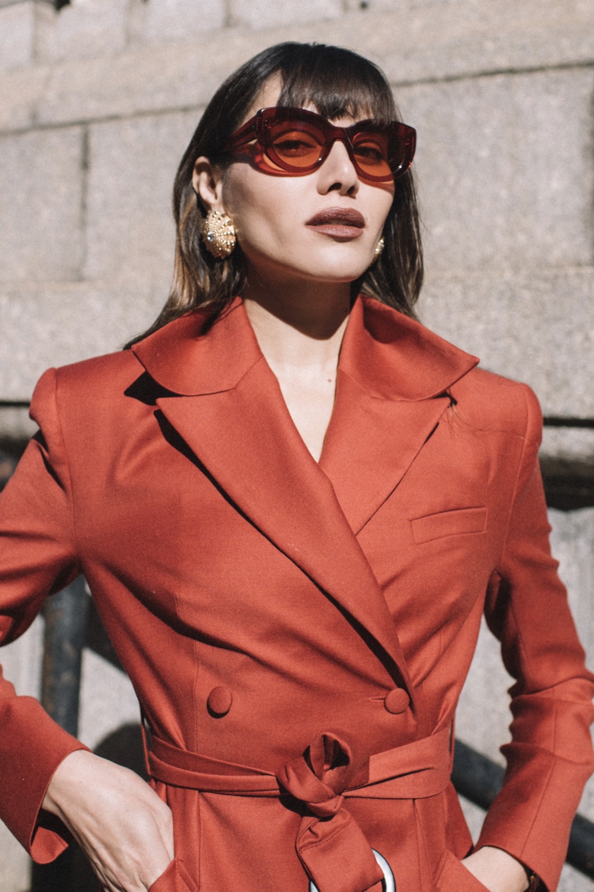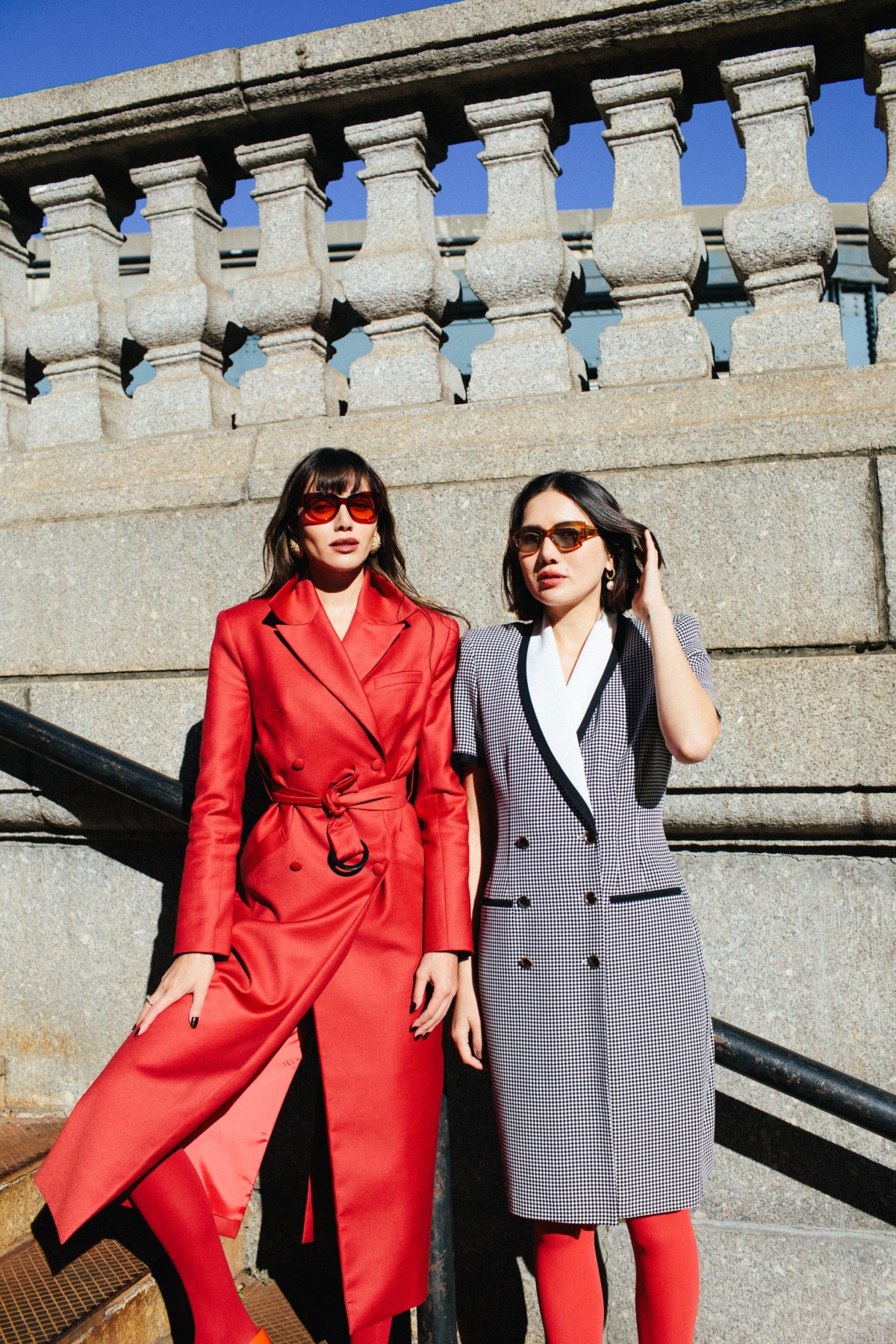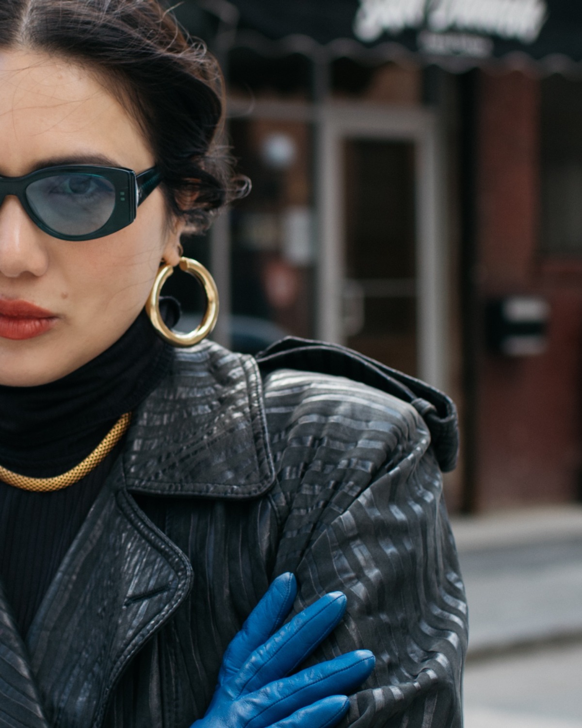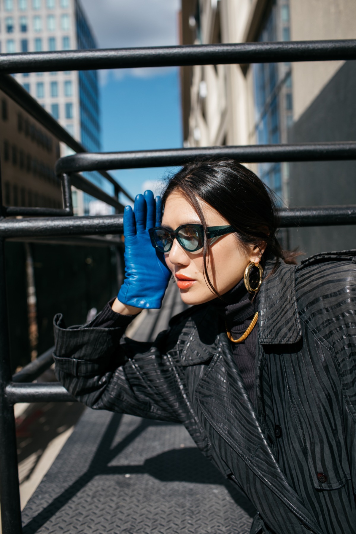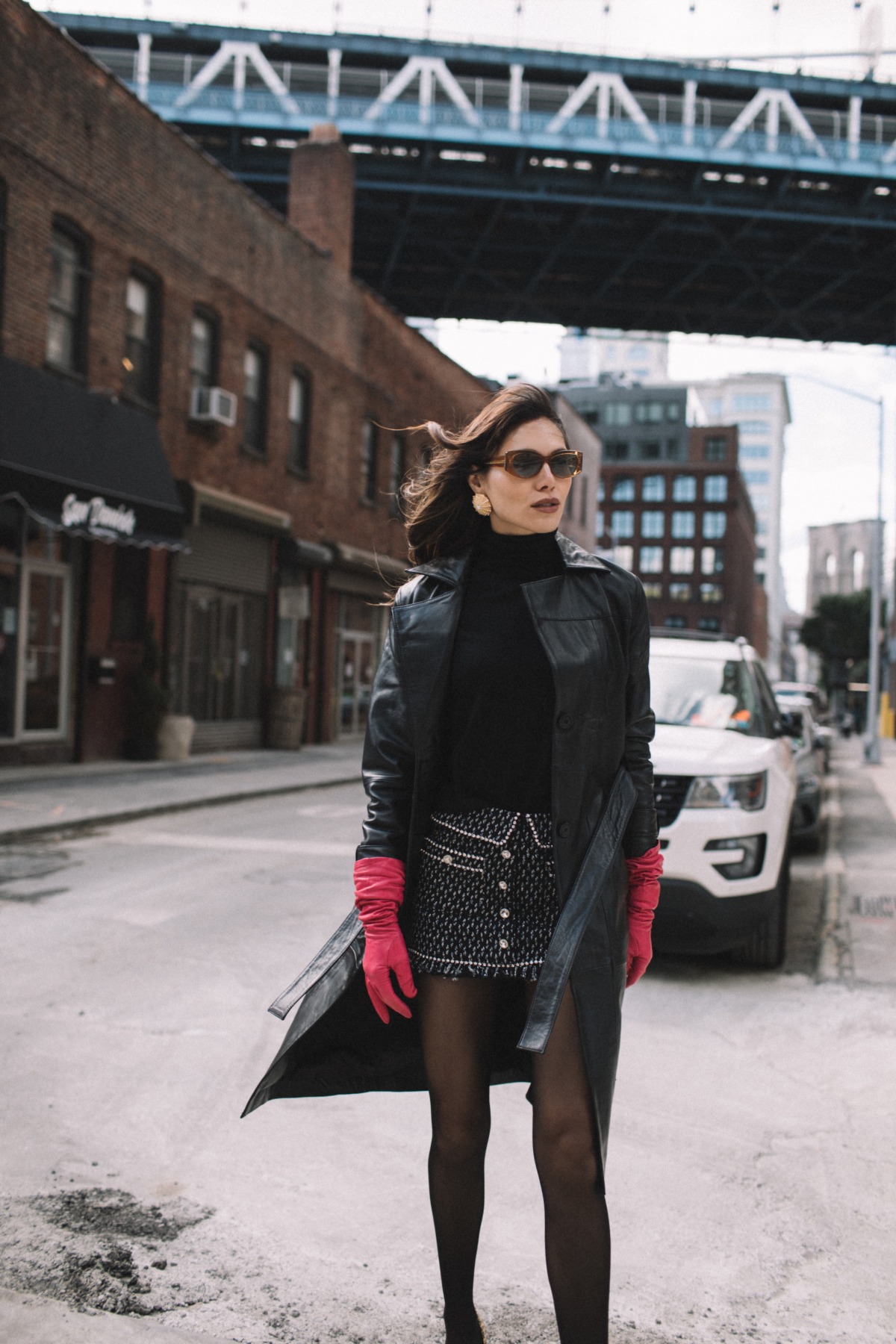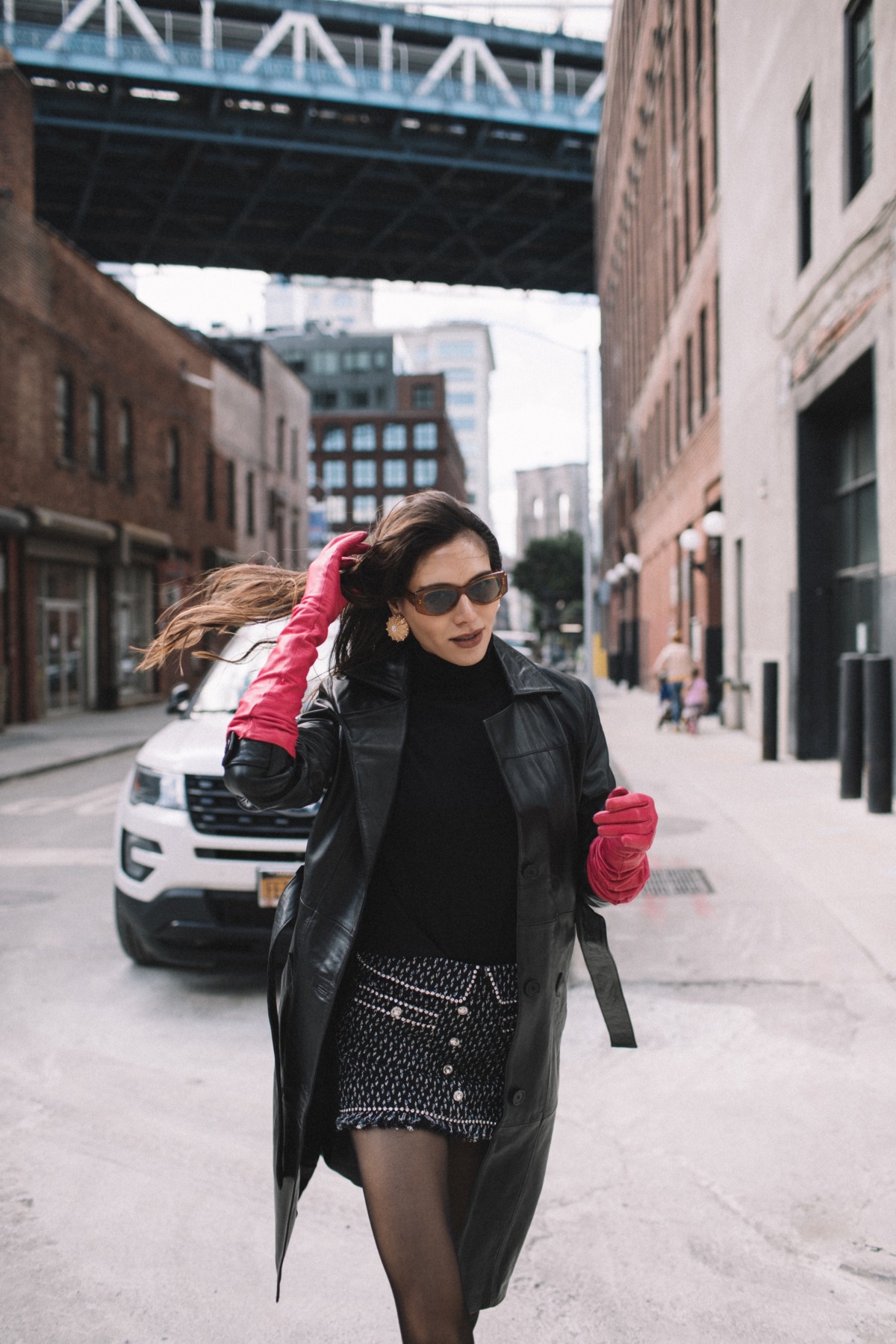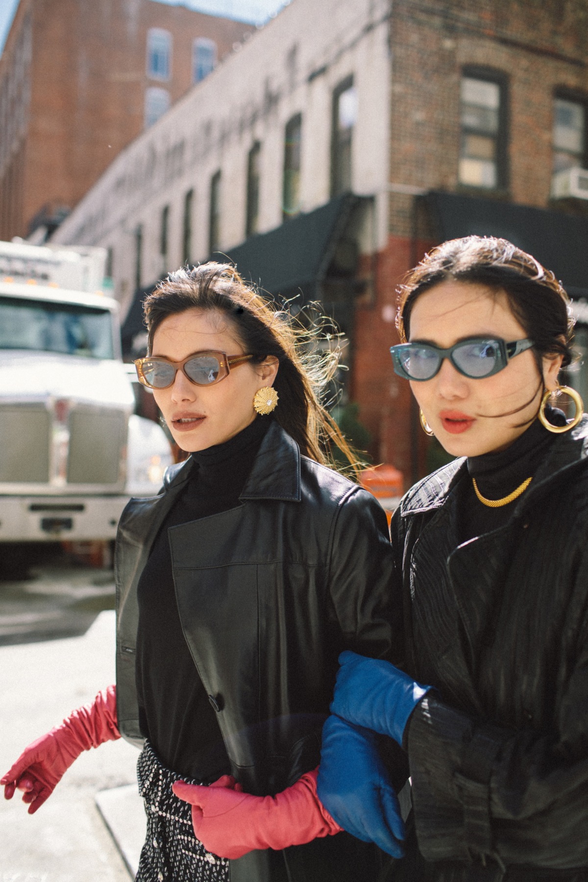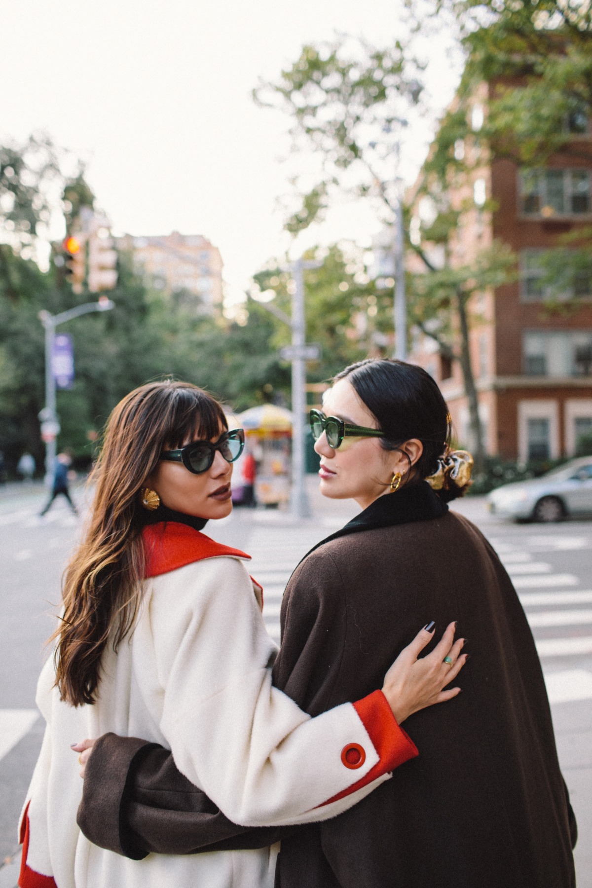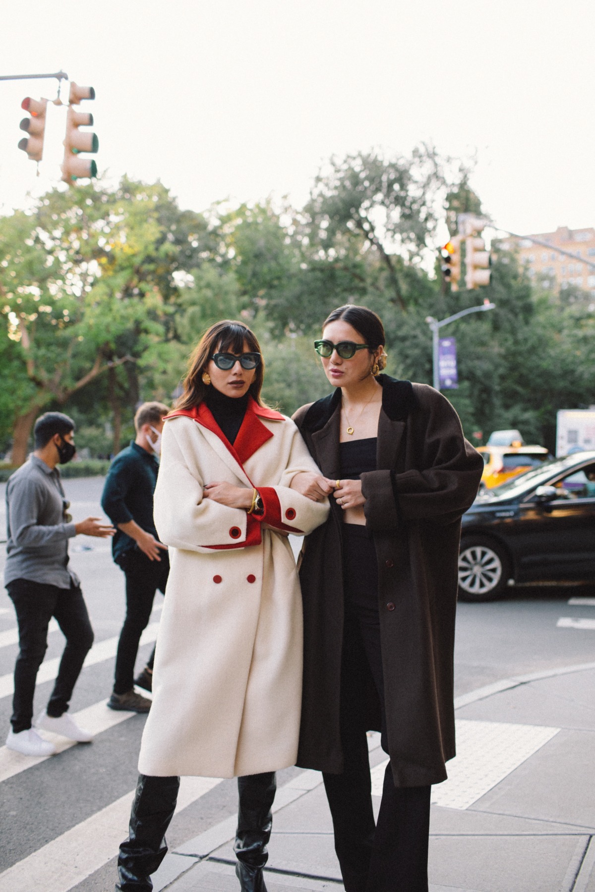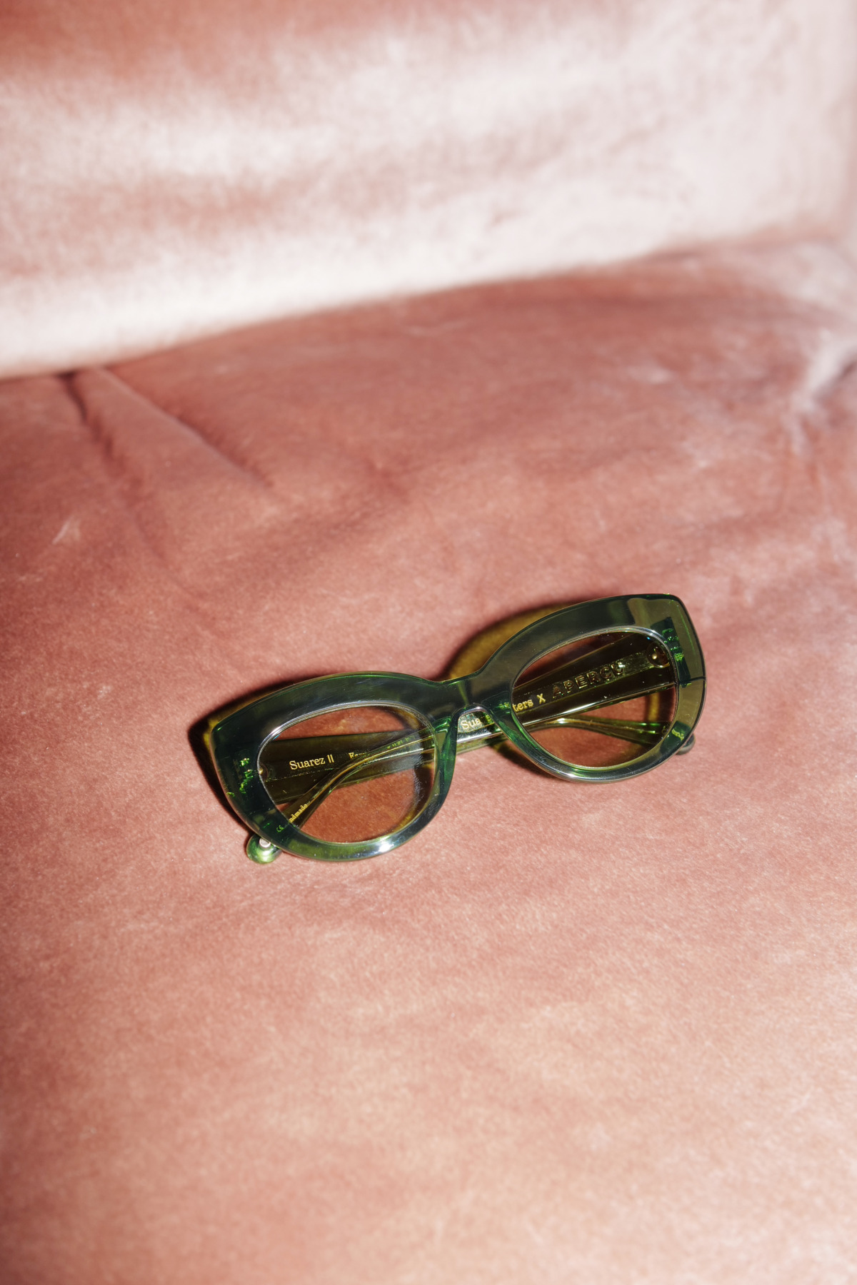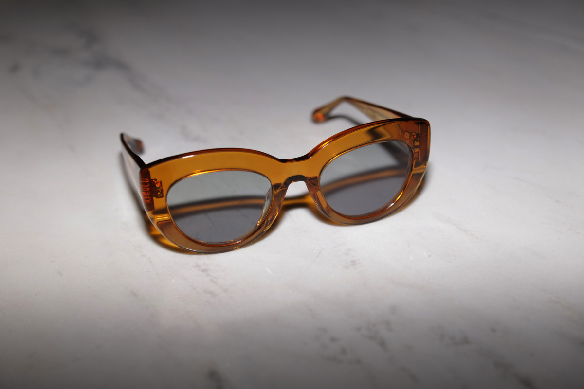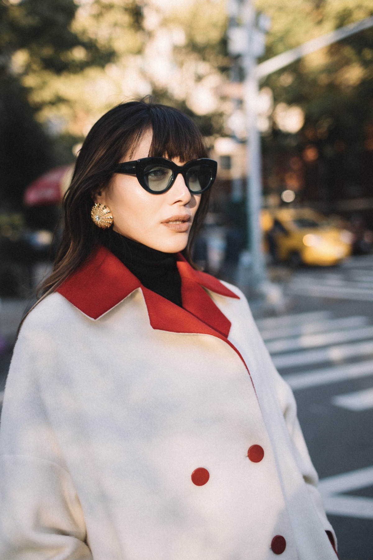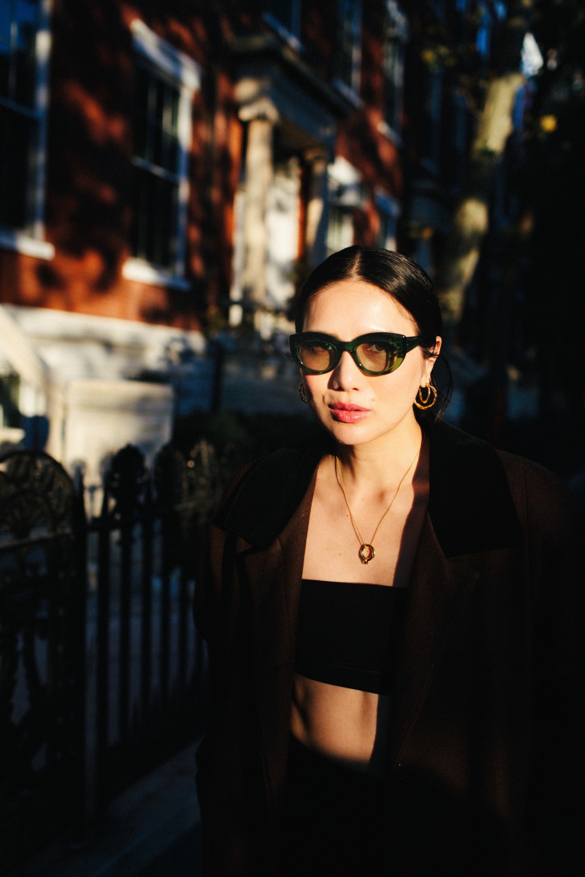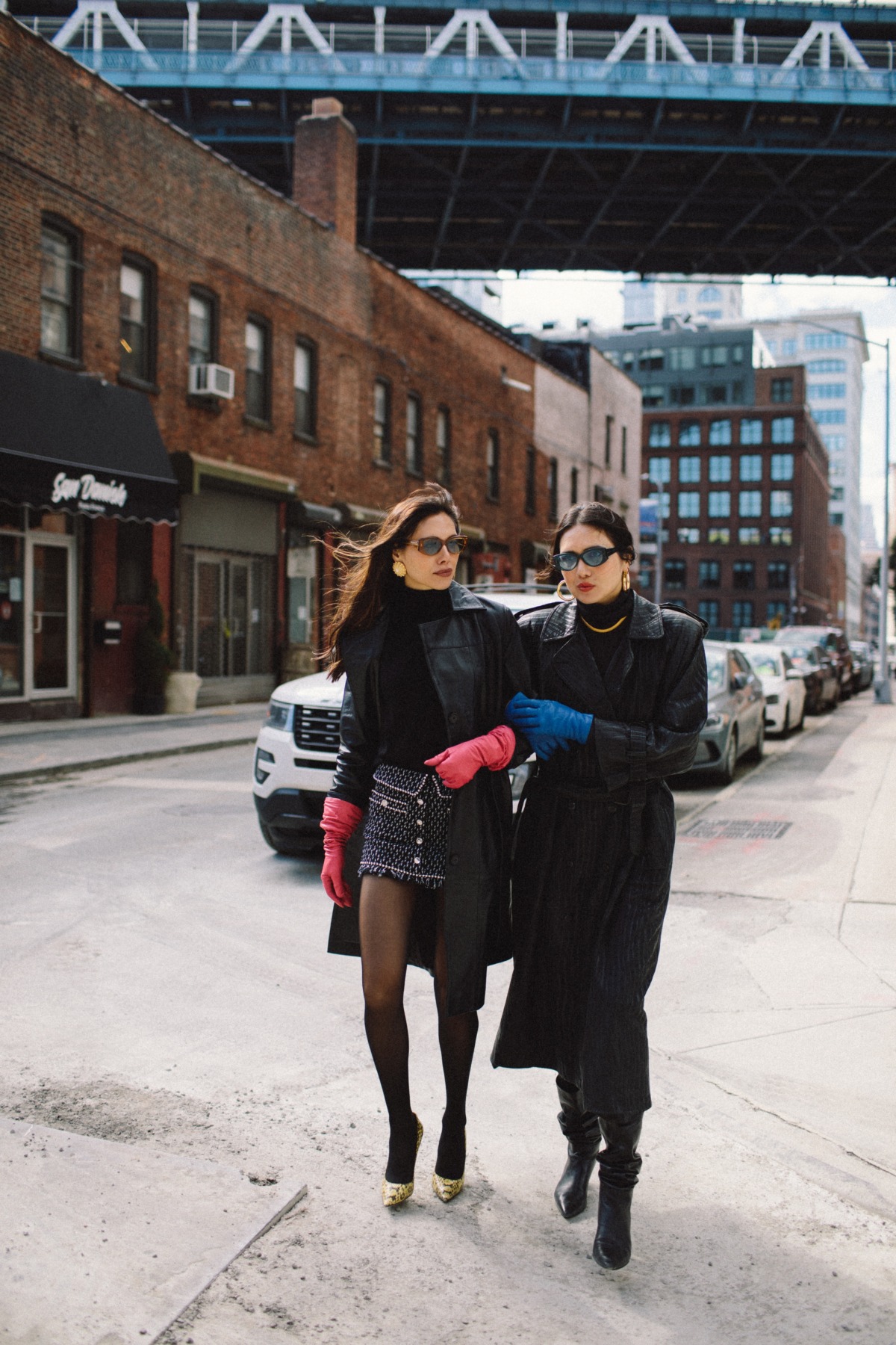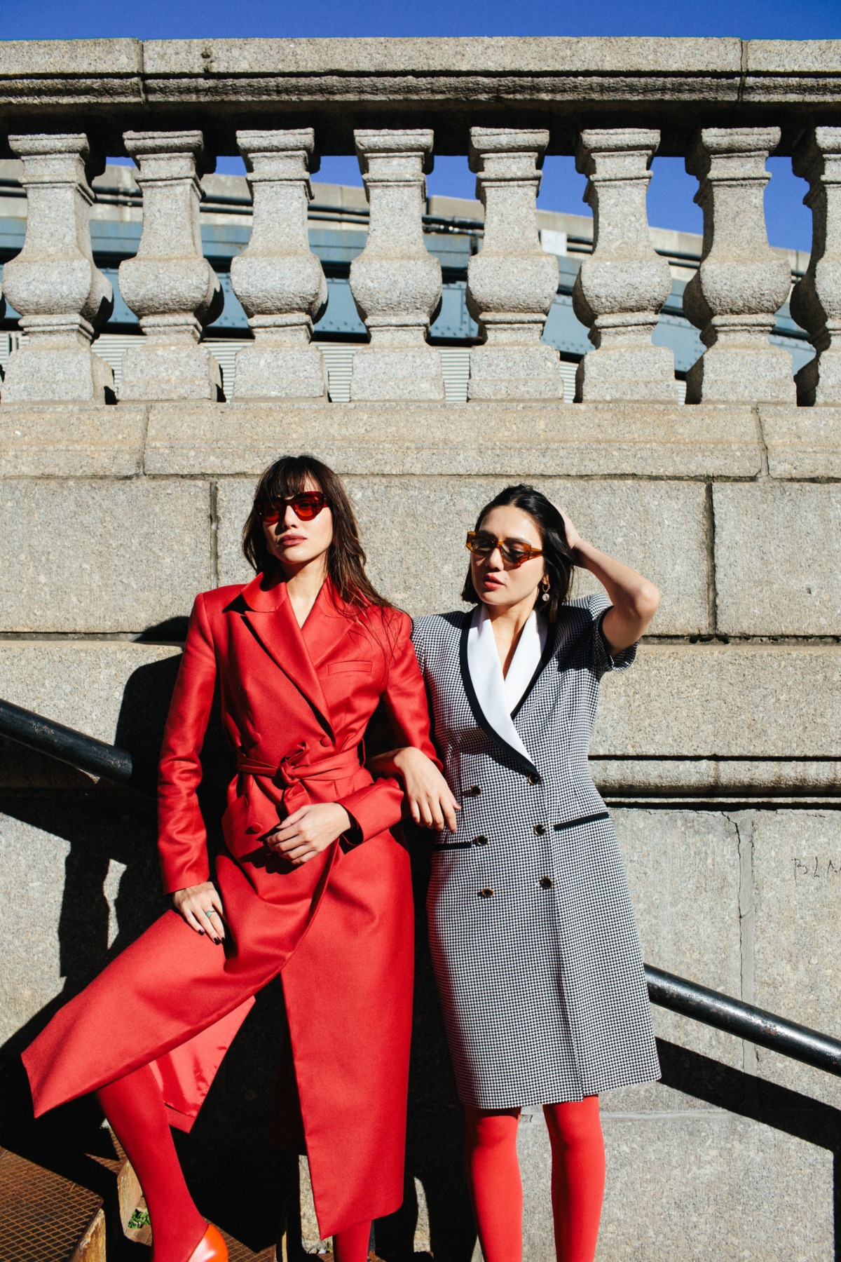
Time to shop our Suarez Sisters x APERÇU eyewear design collaboration! It is officially here and we just celebrated launch day! We designed these beautiful sunglasses with you in mind. You will find our two styles. SUAREZ is a sporty oval style. SUAREZ II is our noveau cat style. Both come in 5 gorgeous colors: Licorice, Fern, Aquatica, Tomato, and Sweet Tea! APERÇU eyewear has been a dream team to work with. Our sunglasses are made with the highest quality, and with a whole lot of love. Which pair is your favorite?
Read the Q+A below. Dylana and I answered a few of your questions, walking you through our inspiration and design process. Thank you APERÇU eyewear for celebrating creators like us through your work! We couldn’t be happier with how our special collection came out!


Why sunglasses? Why now?
As lovers of fashion since day one, sunglasses have always been a way that we made a statement through what we are wearing. We both love that final touch it adds to a look, or how it can fully accentuate a look, or it’s also just a feeling one has while wearing them. A good pair of sunglasses go hand in hand with confidence, and that is something that is so important for us all to have right now. Dylana and I both have very different face shapes. Dyana’s rounder and mine more heart shaped. Eyewear was one thing we didn’t share from our closets. So when the opportunity came about with APERÇU, this idea of a universally fitting pair of sunglasses that looked good on all face shapes was always at the top of our minds. And especially in today’s climate and new normal, sunglasses feel like an accessory just as important as masks. We are wearing less makeup, but it’s okay because we can wear a pair of sunglasses that make you feel good in. We seem to be spending more time in our sweat pants and running our errands without doing our hair at all, and one can still feel dressed up because of a good pair of sunglasses. There is something special about that. We designed these with timelessness in mind, quality in mind, and renewability in mind. The Italian cellulose acetate is made from plant-based polymer made from renewable resources of cotton and wood fibers. The cardboard box is recyclable. Today most people are shopping for essentials that are more lifetime investments, we wanted to design a pair that felt like both like a fashion investment and an essential to be worn for years to come.


What was your inspiration for the two shapes: SUAREZ and SUAREZ II?
Our inspiration was definitely pulled from decades past and we wanted them to feel nostalgic when worn and have that quality feel of a proper retro pair of sunglasses. Our vision was a twist on classic 80’s/90’s sporty styles and a substantial 70’s cat eye styles that one may find in a vintage store in Paris, re-imagined in a way that still felt timeless. We pulled images from old Chanel runways from the 80’s and 90’s, French Vogue, and current Homme Girls editorials to bring to life how we would style out sunglasses, which is bold, a bit masculine yet still sophisticated. We really put a lot of thought into shapes that we felt were universally flattering, so of course, our other main inspiration was every woman! It’s so interesting to see how differently the sunglasses suit each of our faces, and I think that’s the beauty of it. The SUAREZ sporty oval style is definitely the tomboy of the two, and the SUAREZ II nouveau cat style is more feminine, but there is a substantiality to the shape and contours of it that makes it feel so luxe and different. We took the best of both our perspectives and personal styles with these designs, and made something truly together. That in itself was inspirational for us during the design process.


What was your inspiration for the colors?
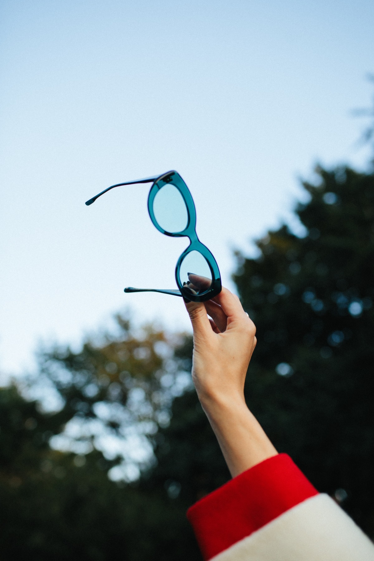
The inspiration behind the color palette was definitely earthy yet bold jewel tones, but we also wanted some classic neutrals thrown into the mix like the black licorice and the brown sweet tea color. We wanted the colors to feel rich so that it felt in tune with the warm and fuzzy feeling of fall, but that could also transition into the warmer months, since we want our sunglasses to be able to be worn year round. It was super fun to come up with our color combinations of frames and lenses, and I think we really nailed it with what we decided to go with. We look at each of these colors, and the colorful ones feel so playful but at the same time, the tones we chose them in seem so timeless, as if they were neutrals. For us, they are essentials in our wardrobe! Our inspiration was definitely based on the tones that we felt we were always looking for but could never find. Like the teal Aquatica color. It’s a blue that nears on black depending on the light, and it just feels so cool and 80’s. I remember seeing an old photo of David Bowie in a pair of sunglasses with teal lenses and really wishing I had a pair. Now I do!


Share the packaging & how you used your own scarf (so personal!) for the cleaning cloth HD print?
There was a lot of nostalgia behind our designs and creative process, and we wanted that to come across in the packaging, as well. So we thought of using the print of our vintage scarves as the print for the cleaning cloth! Warm jewel tones are the foundation of this collection, and I realized that I had so many vintage scarves that fell into this color theme. The one we chose in the end was perfect, like a nice fall red wine. We loved how all of our sunglasses looked against this print, they just all coordinated in such a right way. And the burnt orange bag for the box also felt that way. Warm and autumnal, and that very nostalgic feeling. It’s an orange that we would see a lot in old photos that parents were in, so it felt fitting.


Show the Limited Edition collection now!
